CHAPTER FOUR Watch the two part video supplement for this chapter or scroll down and read the more detailed text version
In the previous version of this analysis I included a short explanation about the layout out of Ullman’s office and the surrounding lobby and hallway areas. Here is a map of the area in question. As the map demonstrates, the window behind Ullman’s desk should not exist because the hotel hallways wrap around the back of the office wall.
The following scenes in the film collectively reveal the spatial impossibility of Ullman's window.
My interpretation of this set design anomaly, as presented in the previous version of this analysis, was that Kubrick was deliberately disorientating the viewer. In response I have occasionally received correspondence from people who believe this piece of set design was simply a mistake in the film making process. However, when I recently acquired a copy of the US version of The Shining, and watched the additional twenty three mins of footage that are not in the European release, I quickly noticed another set design flaw of a similar nature. It is the scene in which Ullman shows the Torrance couple through the Colorado Lounge. The camera, moving sideways, scrolls from one end of the Lounge to the other, giving a full view of the giant windows on the far wall.
At the end of the shot we see another hallway just behind / under the staircase where Jack later gets clubbed over the head. Look in the far background.
Two people with luggage emerge from a hallway that wraps around the back of the wall, but how can this be?
We have just seen five gigantic floor-to-ceiling windows on the very same wall, supposedly giving us a view of the hotel exterior. None of the camera angles in the Colorado Lounge scenes show a portion of the building extending outwards where the mysterious hall is.
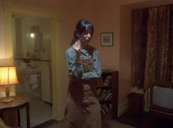
This hallway is also the direction Danny comes from after being strangled in room 237, even though room 237 is on the other side of the Colorado Lounge (scroll down to view a map of room 237's position). Why didn’t he come down the stairs near room 237 or down the huge flight of stairs where Jack and Wendy have their fight? Having found two examples of windows that shouldn’t exist (Ullman’s office and the Colorado Lounge), I decided to go through the film scene by scene and draw maps of the Overlook sets. Here are some of the results. Inside the Torrance’s apartment we find that there are windows in both the living room and bathroom. Due to them being at right angles to each other, the apartment should be placed on a corner of the building structure.
When we eventually get to see an exterior view of the apartment’s location (the scene where Danny slides down a hill of snow from the bathroom window), we find that the living room and bedroom windows could not exist. The exterior wall extends in both directions.
And that isn’t the only spatial impossibility of the Torrance apartment. From our views of the hallway just outside the apartment entrance, we find something interesting. The section of hall that theoretically runs along the outside of the Torrance’s living room and bedroom ends at a T-junction. There is an “EXIT” sign posted up on the right wall, implying that a door and fire escape is just around the corner. Any fire escape in that position would overlap the Torrance’s bedroom or bathroom.
In addition to this there is also a doorway along the same wall, but any room behind it would overlap the Torrance apartment. The scene of Jack axing his way into the bathroom does show a door on the other side of the same wall, but it can’t match up with the one in the hall. As indicated by the small flight of steps just inside the apartment door, the level of the bedroom floor would be several feet higher. Here’s another example of disorientation. The hallways with the strange spaghetti patterned carpets, where Danny is twice drawn toward room 237, feature a variety of spatial defects.The doorway to room 237 is neighboured along the same wall by two other apartment entrances, each just a few metres away.
This doesn’t leave much room for spacious apartments. They would have to be narrowly tucked in side to side, but when we do eventually see room 237’s interior, we find that the entrance leads left into a large living room, which then leads into a large bedroom and then into a large bathroom. The apartment totally overlaps the position where the next apartment should be. The neighbouring doorway on the other side of room 237 should also lead to an apartment, but if we go to the end of the wall, we find that there is a set of doors leading to a stairway.
The stairway connects to the steps on the floor below, which we saw in the long hallway with the dark red floor (seen in Danny’s first tricycle scene). This whole stairway section overlaps whatever room would be found behind the door next to room 237. So the doors on both sides of room 237 don’t lead anywhere. The long wall opposite room 237 separates the entire hallway from the Colorado lounge. From the end of the hall, seen after Danny doubles back on himself in the tricycle, we see right screen that this whole wall would be roughly two metres thick, yet it features five doorways to apartments that spatially cannot exist.
In the same tricycle scene Danny first passes room 237 on his right, then rides around a squared section of walls before turning back down the same long hallway, so that room 237 is now on his left. If we look at the section of walls that he rides around, we find that it is also just a couple of metres thick. On the side facing the Colorado lounge there is a door to an elevator, but on the opposite side it features two doorways. Once again, how could any apartments or even an elevator fit in this small space? Piecing the spatial defects together just for the halls around room 237, we find there are nine doorways leading to apartments that cannot exist. Maybe a couple of these doors could be passed off as storage cupboards, but to pass off all nine doors in such a way is stretching to the extreme, especially since many of them are double doors, just like room 237. In case you still doubt the idea that Kubrick intentionally played with our unconscious sense of space in his set design, here’s another example. As Halloran shows Wendy and Danny around the kitchen, he walks them in a slightly odd path through the various utility tables and arcs back on him self. This can be noticed by the large black door at the beginning of the shot, which features the words “FIRE EXIT – MUST BE KEPT CLEAR” written in huge white letters, and is also seen in the background when they exit the store room. In the latter shot we can clearly see left screen a long section of worktop that Wendy and Halloran manoeuvred their way around while exploring the kitchen (see below).
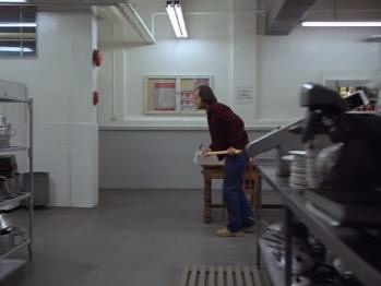
Much later in the film, Jack limps through the kitchen with his axe and walks directly through the space where the worktop should be.
Returning to the first kitchen scene, Halloran disorientates us by taking a spaghetti-like path through the kitchen. He then tells Wendy: “Right here, is our walk in freezer” and opens a big steel door. The shot cuts to the freezer room interior, but watch how the door swings in each shot. In the shot outside the freezer room he grabbed the handle of the door with his left hand, but when the shot cuts to inside he pulls the door open with his right hand … and the door swings open from the wrong side.
When they step back out of the freezer room we find that they have emerged from a door that is opposite the one that they supposedly entered. We can tell this by the large windows of the “Chef’s Office”. It’s also difficult to notice because the camera position has flipped sides from when they entered, giving the impression they’re on the same side of the hall.
So what just happened? Well, my take on it is that Kubrick is playing more spatial mind games with his audience. A strong indicator of this is that when they exit the freezer room we see another set of doors in the background, the left of which is wide open. The open freezer door in the foreground is positioned so that it overlaps the empty door space behind it, indicating that the door can symbolically shift both position and orientation.
Another supporting detail for this is that a small mirror can be seen on the wall opposite the freezer room after they exit, and both freezer room doors also have reflective surfaces.
Mirror props are central to The Shining’s subliminal narrative, which will be covered in subsequent chapters. In this particular scene the mirror prop, which has door shaped dimensions, may be a clue that the freezer room was symbolically mirrored on set. A youtube user who I was discussing this with theorized that an additional scene was cut out of the film, in which Halloran had showed Wendy into yet another storage room. He suggested that Halloran turning his face away from the camera as he spoke the words “walk in freezer” was an indication that part of his dialogue was lifted from another take to compensate for the jarring visual cut. Continuing on with this scene, Halloran walks around a corner and takes Wendy into the storeroom, but another set of spatially jarring details occur. As they walk from the freezer room they pass another door on the same wall, which is just two or three metres from the corner they’re about to turn.
This is yet another of the film’s impossible doorway motifs because any room behind this door would overlap the storeroom, which in size is at least five metres squared.
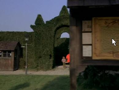
Through a set of windows we can clearly see the much smaller dimensions of the Chef’s Office on the adjacent corner to the storeroom. The original freezer door that Halloran and Wendy entered is right next to it and so the Chef’s Office serves as a visual measuring device, demonstrating how small the storeroom should really be. Obviously, Kubrick wasn’t just interested in making pretty pictures with his set arrangements. Jack verbally hints at the obscurities of the hotel design, while eating breakfast in bed: “It was like I’d been here before. I mean we’ve all had feelings of déjà vu but this was ridiculous. It’s almost like I knew what was going to be around every corner … Ooooohhh.” Repeatedly in The Shining we see doors in the wrong places, impossible windows, and rooms that are too big. Can these all be accidental? For the sake of being thorough, here are yet more examples of spatial mind games in The Shining’s sets. We see the entrance to the hedge maze in three different scenes. The first two times we see it, the entrance is facing the camera and the hotel can also be seen left screen, but when it comes time for Jack to chase Danny we find that the entrance has shifted to a different side of the maze and is now facing the hotel.
Also, in the second shot of the maze, the scene when Wendy and Danny enter, we are shown a map directly outside the entrance. And there is a hedge right behind the map. Shouldn't this hedge be inside the maze?
Both the map and its accompanying hedge are missing in the other shots of the maze entrance, despite the wider and more distant camera positions.
We are never given a clear indication of how the Gold Room connects up to the rest of the hotel either. It is flanked by a mustard coloured hallway that doesn’t seem to spatially link up properly with the one in the hotel lobby (see reception map at the beginning of this chapter). The Gold Room entrance sign in the lobby also switches from one side of the door to the other in different scenes, and for some reason a second Gold Room entrance sign is seen at the actual Gold Room entrance. We’ll return to the subject of the Gold Room in a later chapter. Other sets that are featured without any apparent sense of orientation to the rest of the hotel are:
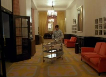
Of course, we can’t expect the film to give us enough visual information to reverse engineer a full map of the entire hotel, but considering the lengths Kubrick went to in disorientating our spatial awareness, he will have at least considered how each set of the Overlook would affect the audience’s unconscious maps of the building. If we think of The Overlook in terms of major set pieces, such as kitchens, gold room, Colorado Lounge and so on, it would be logical to assume that Kubrick and his set designers would at least have come up with a rudimentary map of how these locations would relate to each other. I managed to do this fairly accurately in my short film The Sex Game, in which the story took place in a single house, but was shot in three different locations. Yet, here in The Shining Kubrick plays yet more spatial mind games. Here's a glaring contradiction. Wendy is shown preparing meals in the kitchen and she also wheels Jack's breakfast through to the lobby from the gold room area.
On that basis we can assume that the kitchen is close to or just beyond the gold room. But later, as Jack limps through the hotel to kill Halloran, he first passes through the kitchen and then he enters the lobby from the opposite side of the gold room, near Ullman's office. The kitchen can't be on both sides of the lobby.
On the larger scale, a very prominent spatial contradiction is the difference between the Overlook interior and exterior. The exterior shows that large sections of the hotel are built at odd angles to each other, yet all of the interior sets feature rooms and halls that use perfect right angles. The aerial shot of the Overlook Hotel is footage of a real hotel called the Timberline Lodge.
Considering that a large set was built in England to mimic the Timberline Lodge exterior, Kubrick could easily have had the interior sets built to more closely resemble Timberline as well, but he chose to base much of the interiors on the Ahwhanee Hotel, which has a completely different look.
More info about the Overlook Hotel sets can be found at http://www.unrealaudio.net/theshining2/realoverlook.htm. The author of the site has also conversed with Gordon Stainforth, who assisted Kubrick in editing the film. Stainforth mentions the bizarre flipping of the freezer room entrance, but makes no mention of an additional scene being shot and edited out. So having established that the sets of The Shining were designed with deliberate spatial defects, you’re probably asking yourself “Yeah, so what’s the point?” The point is that the Overlook is not just a place of isolation. It is a symbolic maze – a vast labyrinth of winding corridors, mysterious open doorways and disorientating design. When the characters speak, their voices often echo throughout the hotel, reminding us of its scale and emptiness. In many scenes, such as Danny's chat in the kitchen with Halloran, we can hear very faint noises echoing throughout the hotel. Sometimes these sound like objects being moved and sometimes like distant voices. The films soundtrack incorporates many noises that are distant and echoed, again implying a large isolated labyrinth (the music of room 237 an excellent example). The big giveaway is that the map we see outside the maze entrance and the table top version that Jack looks at are identical … that is until we cut to the top down view (the one where we see Danny and Wendy as ant-sized figures in the centre). At this point the maze paths have altered and are symmetrically mirrored, both vertically and horizontally. It's layout is also much larger and there is no exterior edge. Danny and Wendy are symbolically trapped in a never-ending maze of mirrors.
The daytime shots of Danny and Wendy walking through the maze together also mismatch the map shown outside it's entrance. The easiest way to notice this is to look at the top of the hedge walls immediately after we cut from the maze map outside. The top of the hedge is arched, revealing it to be the maze entrance, at which point they took an immediate left turn. According to the exterior map they should have then walked a very long and straight path, but in the footage the maze has a different layout.
Even the small scale maze map, shown in the making-of documentary of The Shining, mismatches the maps seen in the film. The daytime maze footage consists of two shots. The second one matches up with the portion of the maze map highlighted in red (including the dead end they encounter), but the first shot follows a course that doesn't match up with any part of the map. Even if we flip the footage along it's vertical plane it still doesn't match up. However, the night time shots of Danny and Jack running through the maze in the film's climax do appear to match up with the small scale map given out on the set. The changing maze layout between the two daytime shots could only be achieved if, A) Kubrick had more than one maze set to film in, or B) The existing maze layout was altered between shots. Personally I'd put my money on the latter. The following production story suggests that Stanley played a practical joke by having the maze set altered during the shoot without handing out updated copies of the map. Kubrick had an exacting overhead-view map of the maze, which was used to get in and out and to plan shots. Copies were given to the crew, who nevertheless continued to get lost throughout the production. Garret Brown (steadicam inventor and operator) recalled that if you got lost and called out “Stanley!” Kubrick’s laughter seemed to come out from all directions inside the maze. - p437 Stanley Kubrick by Vincent Lobrutto The terror of being isolated in a maze, while being eternally chased in never-ending circles, is communicated in the tricycle scenes. Danny rides a full lap around the Colorado Lounge and an adjacent hallway until he’s back where he started, just as he loops back upon himself before encountering the locked door of room 237. In both of these scenes he is chased by an observing camera, of which he has no escape. However, in the final maze chase of the film Danny again does a full lap upon himself, but this time breaks the loop and makes his way to the maze centre (his path is highlighted in blue on the map below). Scale is also important in this film. The imposing size of the hotel, its oversized carpet patterns, the mountain ranges, and especially the huge Gold Room and Colarado Lounge, make the characters look small and defenceless - like helpless children. Add this to the solitude of the Torrance’s circumstances and the psychological brew is potent. These are some of the key elements that give the film its unsettling creepiness. And it does this almost entirely without the clichéd cobwebs and dark shadows of other ghost stories.
Note: Screenwriter John August has written of his disagreement with my interpretations of deliberate spatial disorinetation. His critique can be read here and my response here.
|


